Waypoint
Pipeline metrics dashboard that tracks deal stage conversion, velocity, and SLA breaches, giving the investment team a single screen for pipeline health.
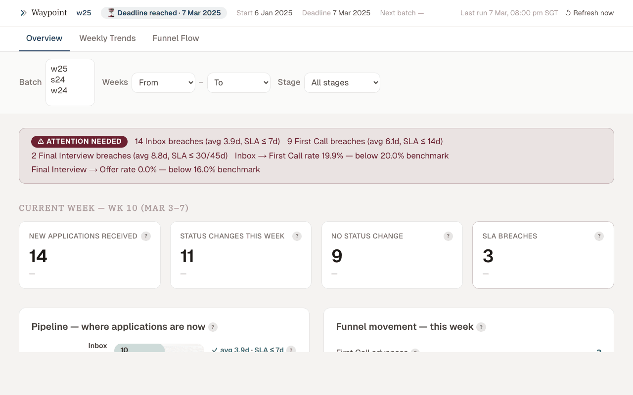 Waypoint pipeline dashboard
Why I built this
The team reviewed the pipeline weekly but had no single view of how deals were moving. Stage conversion rates, time-in-stage, and SLA breaches were scattered across Airtable views and spreadsheets. The question at every meeting was the same: "which deals need attention right now?" I built Waypoint to answer that question in a 30-second glance.
What it does
Waypoint tracks where every application stands in the investment pipeline. It shows stage-by-stage conversion rates, deal velocity metrics, and SLA flags, so the team knows how fast deals are moving and where bottlenecks form.
Data model
Pipeline stages
The pipeline follows a defined stage sequence, each with its own SLA:
| Stage | SLA (days) | Description |
|---|---|---|
| Inbox | 3 | New application, awaiting initial review |
| First Call | 7 | Scheduled or awaiting first partner call |
| Final Interview | 10 | GP-level interview scheduled or in progress |
| IC Review | 5 | Investment committee deliberation |
| Term Sheet | 14 | Offer extended, awaiting founder response |
SLAs are configurable per batch (each cohort has different velocity targets). A deal breaching its stage SLA gets flagged with a red indicator and surfaces at the top of the dashboard.
Airtable sync
Waypoint pulls from the Applications table in Airtable via the REST API. The sync runs on page load with a 5-minute cache (Vercel KV). Each application record includes:
- Current stage and stage entry timestamp
- Partner assignments (inbox reviewer, first call partner, GP interviewer)
- Batch identifier and application metadata
- Stage transition history (computed from Airtable's
Last Modified Timeper stage field)
Computed metrics
From raw stage data, Waypoint computes:
- Conversion rates: % of deals advancing between each stage pair, with batch-over-batch trend
- Velocity: median time-in-stage per stage, flagging outliers beyond 1.5× the median
- SLA compliance: % of deals currently within SLA per stage, with breach count
- Partner load: deals per partner at each stage, for workload balancing
Dashboard design
What got cut
The first version had 12 widgets. By the third pipeline review meeting, only three were being referenced:
- Cut: total deals ever (only goes up, nobody acts on it), source channel breakdown (useful quarterly, not weekly), geographic distribution (interesting but not actionable in a pipeline review), partner NPS scores (wrong meeting for this)
- Kept: stage conversion funnel, deal age distribution with SLA flags, partner load heatmap
The principle: if a widget doesn't change how someone acts after the meeting, it's noise.
SLA as primary alert
Rather than color-coding every metric on a gradient (green/yellow/red), Waypoint uses binary SLA flags. A deal either needs attention or it doesn't. Defining "too long" per stage turned out to be more valuable than the dashboard widget itself because it forced the team to articulate what "healthy velocity" actually means.
Technical decisions
- Vercel KV caching over real-time sync: Airtable's API has aggressive rate limits (5 req/sec). Caching with a 5-minute TTL gives near-real-time data without hitting limits during a meeting where 8 people load the dashboard simultaneously.
- Server components over client-side fetching: all data fetching happens in Next.js server components. The client receives pre-rendered HTML with the latest metrics. No loading spinners, no waterfall fetches.
- No charting library: the funnel and heatmap are CSS Grid + inline styles. Recharts or Chart.js would have been faster to build but harder to match the exact visual density the team wanted. Custom rendering gave full control over pixel-level layout.
Stack
Next.js 15, React 19, Airtable API, Vercel KV (caching), Tailwind CSS, CSS Grid (custom charts), Vercel
Sole engineer at Iterative (early-stage VC fund, SEA & South Asia), building data infrastructure and AI systems for investment operations. Runs fracxional for fractional CTO/CPO work and wxrkflows for automation systems and operator training. Based in Ho Chi Minh City, Southeast Asia.